This small article might help you to figure out quickly how to work with the AddThis module for Drupal.
It is not a substitute to the original documentation : it just provides a concrete view of the configuration process from my experience.
Configure it
Here is an overview of the main steps to get AddThis working on Drupal :
- install the module : http://drupal.org/project/addthis
- choose in which nodes it appears : page, story, teasers, ...
- select which type of widget you want : they are called "button" and "toolbox" in the configure tab
- build the widget by adding components to it (only for "toolbox") : components includes popular buttons like facebook like, google +1, tweet, but also custom elements like separator, addthis 'more' button
- add a service customization for each component you listed : this step simply provides each component with adequate parameters
- customize it more using the numerous other options
Introducing the widget type
There are two types of widget :
- button : a thin button that will open a popup menu on hover ; not obstrusive : doesn't add too much to your design
- toolbox : the most configurable ; a sequence of custom buttons
Sample button : 
Sample toolboxes you could build (from AddThis's website) :
Building a toolbox
There are 3 states the widget can be :
- default, what is displayed with the page
- compact menu opened ; i.e. when the user hover the widget
- menu expanded ; i.e. when the menu is clicked on
The configuration page of the module simply offers you to define what you put in each state with 3 fields : "Toolbox services" (the default state can only be changed for toolbox), "Compact menu services" and "Expanded services".
In each field, you will enter a comma-separated list of the components (called "service codes") you want in your widget. The list of available "service codes" are printed on the configuration page.
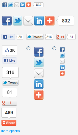
For instance, if you would put facebook_like,tweet,google_plusone,counter_pill in "Toolbox services" on your site, this would display facebook, twitter and google "+1"-like buttons, plus a button to open the AddThis menu on hover : 
In the other states you can change the services you want to include and their order. A lot of them are available...
Customize your services
For each component (a.k.a. "service") added to your widget, you should add a service customization (in the "Customize services" tab) where you will list the options/parameters you want for this button : this is the way you can change the default behavior.
Options are specific to each service so you will have to look at the provider's developer pages, but the module provides links from its configuration page so you will reach the options list of each service within a few clicks.
Some important details :
- In "service_code", just put the same service code that you used in the "Toolbox services" field (i.e. "google_plusone" or "facebook_like", ...).
- The options go in the "HTML attributes" field, space separated like if they were added to the HTML tag of the widget. For instance : g:plusone:annotation="none" g:plusone:size="medium".
- The "HTML classes" field must be filled because as soon as you define an entry here for a service, it looses its default classes and the button does not even shows up on the page (this should really be enhanced in future versions of the module). What I did to get around this was to pick the default classes and put them back in this field. For instance, for google_plusone I put "addthis_toolbox_item addthis_button_google_plusone at300b" (note the space between the 3 classes).
Important : you will have to manually add CSS classes in the "HTML classes" field otherwise the button will not appear. For this, simply try first with no service customization, and copy the default classes from the HTML source in this field.
Few enhancements could be a better alignment of icons, since they're not all same size. This can be fixed by choosing the appropriate widget for each button, and by adjusting their options.
Another limitation is that you can only use one type of widget (button or toolbox) in all nodes. But this is easily patched in the addthis.module file :
function addthis_link($type, $node = NULL, $teaser = FALSE) {
// Check whether AddThis is set to display on this node.
...
$addthis_widget_type = variable_get('addthis_widget_type', 'addthis_button');
// We force here the type of widget to display in teasers
// The default type chosen in addthis configuration will be used in other nodes (pages)
if ( $teaser ) {
$addthis_widget_type = 'addthis_button';
}
Another advantage of this module is that you can add it as a block where you want. This allows for instance to add it in some unique places like once for the front page, instead of once for each article/teaser.
My feeling
After trying several social sharing modules, I'm very satisfied with this one, because it is quite configurable and supports all options for each button.
As far as I've tested, it works just fine on mobile devices.
References
 Me on Twitter
 English
 Français
Comments
Post new comment